Wikipedia is a popular free online encyclopedia project with around 1.8 billion visitors monthly. It is based on the model that everyone with internet access can freely add, edit and distribute content in compliance with its policies and guidelines. Currently, Wikipedia has more than fifty-seven million articles in more than 300 languages
My Goals
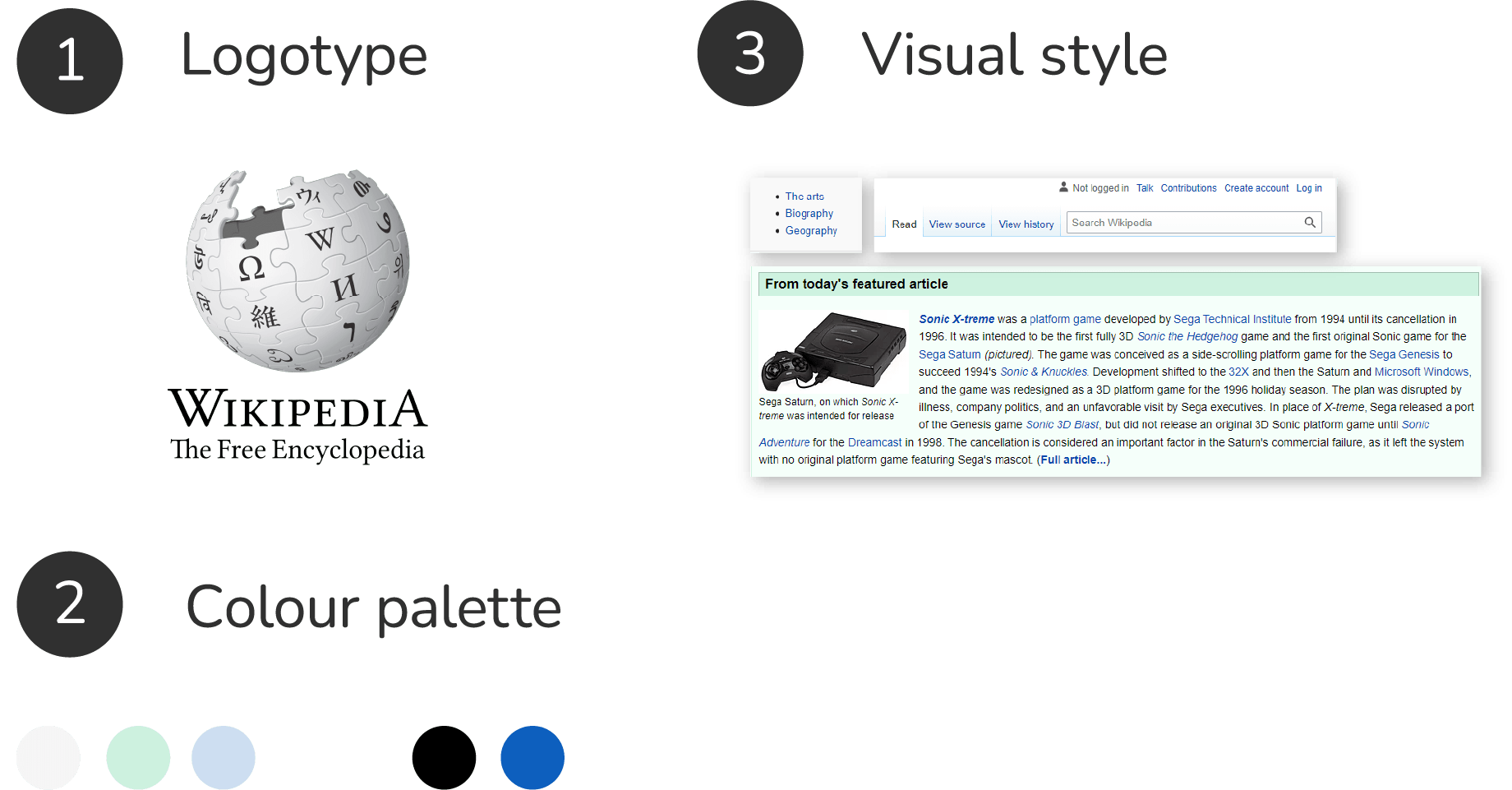
- To create a new visual concept for the brand identity supporting the main Wikipedia values and to become more appealing to the target audience
- Significantly improve the user experience of the web platform
Wikipedia's mission is to be the trusted platform for seeking and sharing knowledge. One of the fundamental principles Wikipedia stands for is: this platform was created to be an encyclopedia, not a vanity press, and each of its articles should be written or edited with a neutral point of view
target audience
Anyone seeking to acquire knowledge in various specific and nonspecific study fields and (knowledge) areas. Starting from secondary school students at the age of 13+ to university students, instructors, scholars and general users looking for specific information
Media/Environment/situation
Digital platform (mobile/desktop)
Competitors
- Encyclopedia Britannica Online
- Encyclopedia.com
- Infoplease
Unique selling point
Wikipedia is free to use and distribute.
Anyone can write or edit articles following its policies and guidelines.
Brand or product attributes. tone, look and feel
- Up-to-date
- Trusted
- Universal
.jpg)